
Welcome to FanNation, Part of the Sports Illustrated Media Group
Find and follow your favorite team here. Get the latest news and updates about the team you care most about.
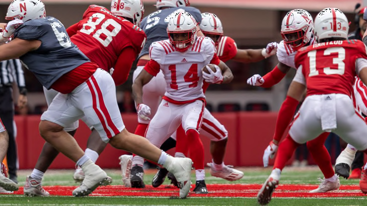
What Should Fans Look For in the Nebraska Spring Game?
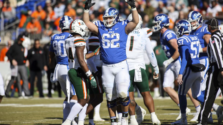
Husker Dan: It will be more than a Dylan-Danny duel on Saturday
Recent Articles
NBA Admits Big Missed Calls in Clippers vs. Mavericks Game 2
The NBA has released their Last Two Minute Report for Clippers vs. Mavericks Game 2
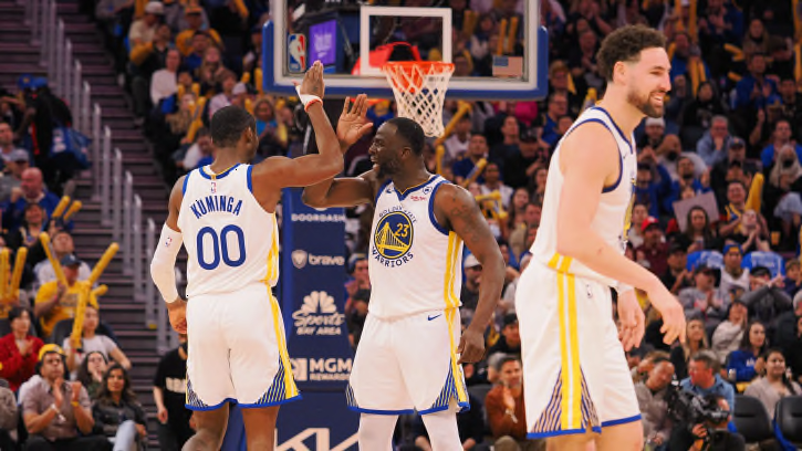
Golden State Warriors' Official Draft Pick Number Revealed
The Warriors don't have a great spot in the draft.
Social Media Star 'Sketch' To Announce Houston Texans Draft Pick
The viral sports streamer will take the stage to assist the Texans in announcing one of their draft picks.
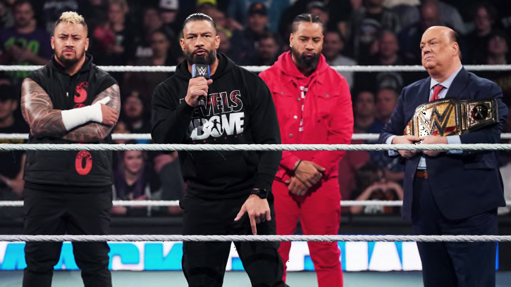
Huge Member of WWE's The Bloodline Faction Suffers Injury After WrestleMania 40
One key member of WWE's The Bloodline faction has suffered an injury.

Chicago Cubs Move Superstar to Injured List, Call Up Top Prospect
The Chicago Cubs will now feature their No. 1 overall prospect after they had to move their superstar to the injured list.
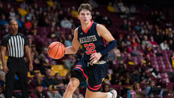
Gophers interested in Macalester transfer Caleb Williams
Williams scored 41 points against the U in an exhibition game last fall.
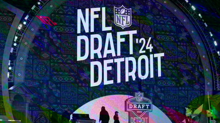
Report: Lions among Teams Looking To Trade Up
Could Lions trade up in NFL Draft?
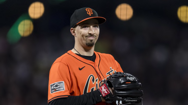
San Francisco Giants Fans Urged to Panic Over Cy Young Winner's Start
The San Francisco Giants fanbase is urged to panic over the start of the Cy Young's season.
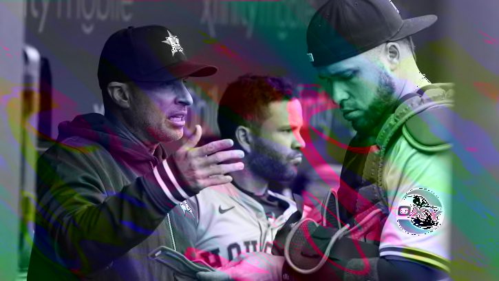
Should Houston Astros Already Consider Replacing Manager?
The Houston Astros might need to move on from manager Joe Espada before it's too late.
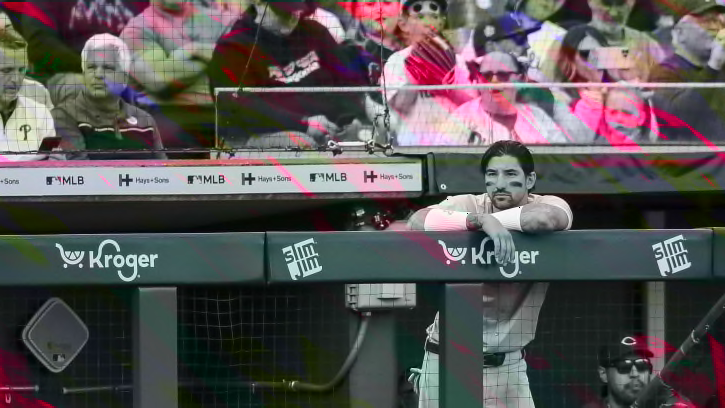
Phillies Fans Urged to Worry Over All-Star Being 'Awful'
The Philadelphia Phillies fanbase is told to worry about an All-Star being "awful" to start the year.
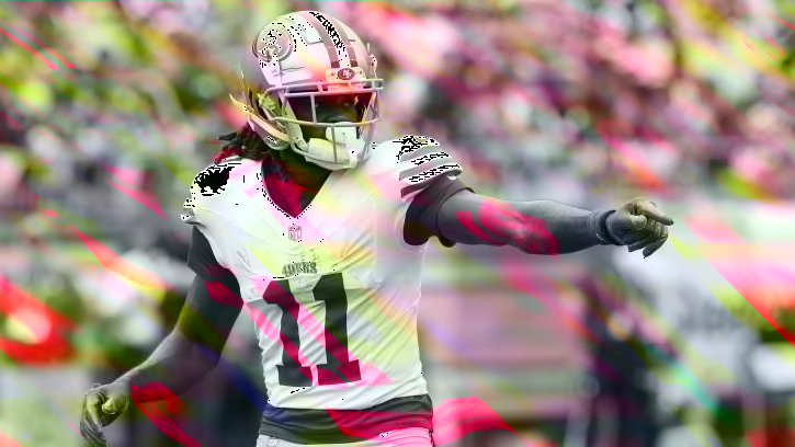
Would Trading Brandon Aiyuk be a Mistake by the 49ers?
Trading Brandon Aiyuk is on the table for the 49ers as the NFL draft quickly approaches. Would it be a move that the 49ers come to regret should they pull the trigger on a trade?
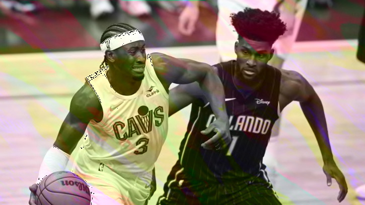
Caris LeVert Reveals Cavaliers’ Goal For Game 3 Against Magic
The Cleveland Cavaliers look to "set the tone" against the Orlando Magic in Game 3.
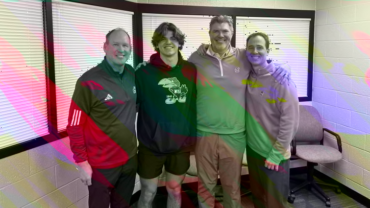
Watch: Kansas Commit David McComb Shares Training Video
David McComb is to be elite
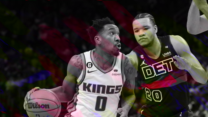
Insider Links Western Conference Guard as Potential Pistons Target
The Detroit Pistons could have their sights set on a Sacramento Kings guard.
Naz Reid Wins NBA Sixth Man Of The Year Award, Bogdan Bogdanovic Finishes 5th
While he was not a finalist for the 6th Man Of The Year Award, Atlanta Hawks guard Bogdan Bogdanovic picked up some first-place votes and finished 5th in this y
Dallas Mavericks Win Game 2 To Tie Series Against Clippers: 3 Game-Changing Plays
It took everyone on the Mavericks to come away with a win over the Clippers in Game 2
Dolphins Mock Draft Roundup: What's The Consensus for Round 1?
Breaking down the multitude of national mock drafts and what they predict for the Miami Dolphins in the first round
NBA Legend Rants About Sixers-Knicks Controversial Ending
Shaq defends the Philadelphia 76ers after their Game 2 loss against the Knicks.
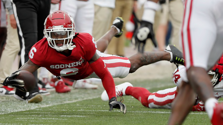
How Deion Burks' Elite Speed Changes the Dynamic for Oklahoma's Receivers
The Sooners' speedy transfer from Purdue plays the same position that Drake Stoops thrived in last year, but can he be that productive on a weekly basis?
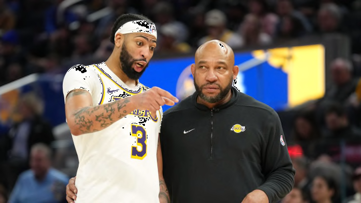
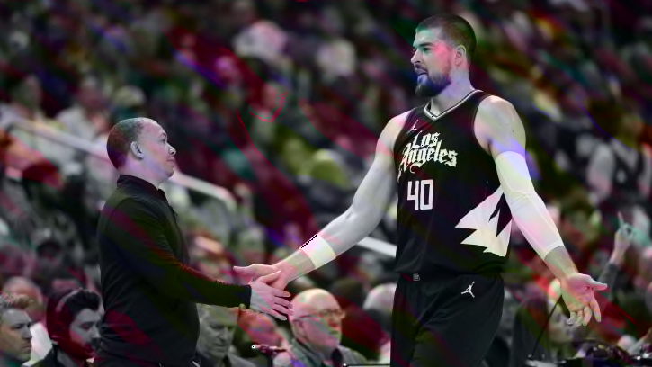
Anthony Davis and Darvin Ham Have Alarming Disagreement Before Game 3
Darvin Ham believes Anthony Davis is frustrated.
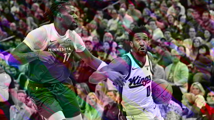
Naz Reid Steals 6MOTY Award From Kings' Malik Monk
Timberwolves' Reid took home the award, but Kings' Monk was seemingly robbed.
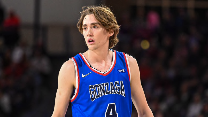
Analyzing Dusty Stromer's freshman season at Gonzaga
Stromer demonstrated a professional approach to the game in his first season in Spokane
'25 PF Trent Sisley Receives Louisville Offer
The forward from Indiana is regarded as a four-star prospect in the Class of 2025.
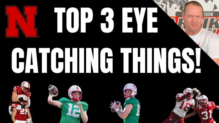
Carriker Chronicles: Three Things to Watch for Saturday at Nebraska Football’s Spring Game
Also, Adam provides an update on his heart health