
Welcome to FanNation, Part of the Sports Illustrated Media Group
Find and follow your favorite team here. Get the latest news and updates about the team you care most about.
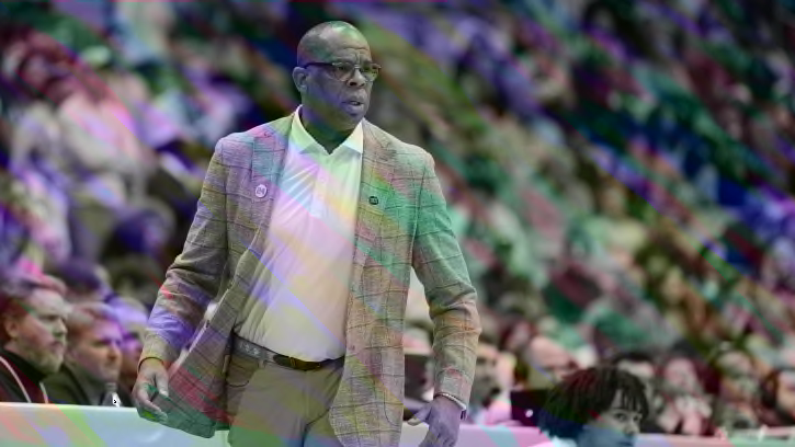
UNC Basketball: Hubert Davis Makes Bold Move on Transfer Trail
UNC basketball coaches were in Kentucky, hoping to bring home a huge commitment.
Recent Articles
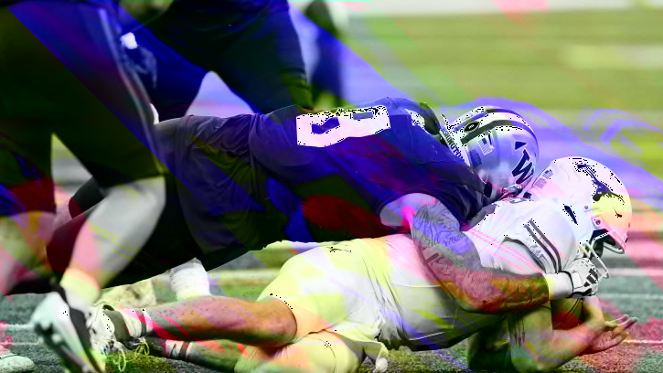
Steelers Comfortable with Troy Fautanu's Medical Concerns
The Pittsburgh Steelers have no concerns about Troy Fautanu's reported knee issue.
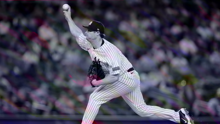
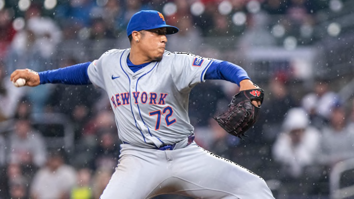
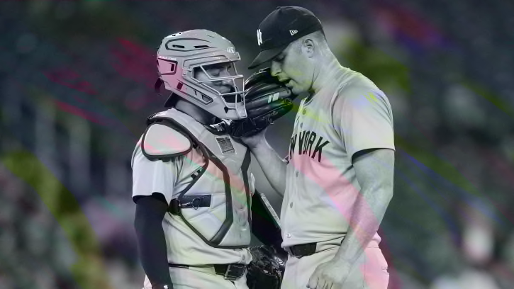
Yankees Superstar Won't Join Club On Upcoming Trip But Is Making Progress
New York won't have one of its best players back in the next week
'He Loses Focus': Bill Belichick Critiques Terrion Arnold
Former NFL coach gives his scouting report on Terrion Arnold.
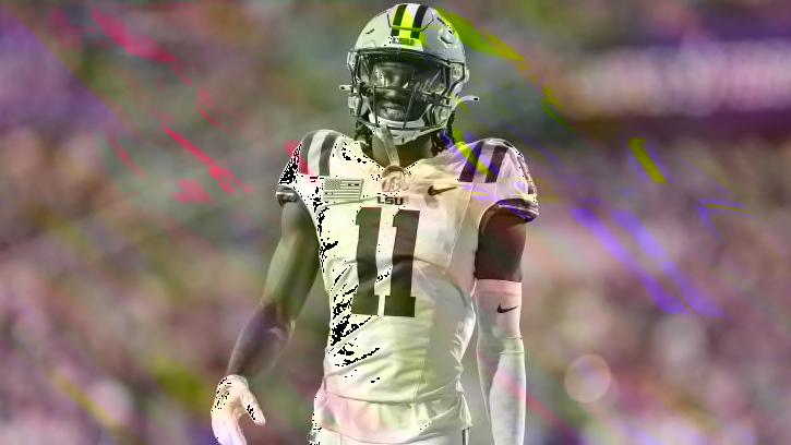
LSU Football: Star Wide Receiver Brian Thomas Jr. Selected No. 23 Overall in NFL Draft
Thomas Jr. becomes the third Tiger selected in the first round, flew up draft boards during 2023 season.
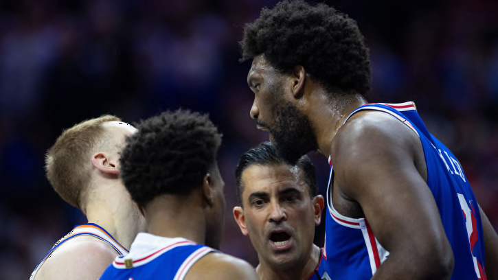
Joel Embiid Defends Flagrant Foul on Knicks' Mitchell Robinson
Mitchell Robinson left Thursday's New York Knicks playoff tilt with an ankle injury after a couple of encounters with Joel Embiid.
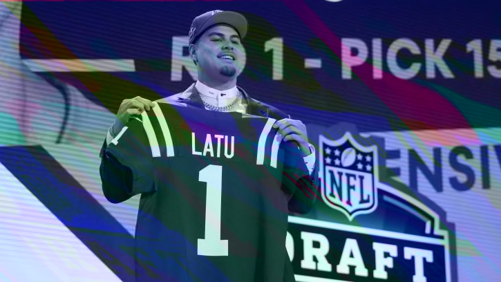
Colts' Laiatu Latu Ready to Prove He's The Best Defender in NFL Draft
The Indianapolis Colts took the first defensive player of the 2024 NFL Draft in Laiatu Latu, who wants to affirm they made the right choice.
Ex-Rays All-Star Could Be Option To Give Cardinals Boost Due To Injuries
St. Louis surprisingly could use a little more outfield depth right now
Cincinnati Bengals NFL Draft Targets Round Two: Plenty of Talent Still on the Board
The Bengals have three selections on day two of the 2024 NFL Draft, including the No. 49 overall pick.
Xavier Worthy's First Thoughts on Being Drafted By Chiefs
Following the first round of the NFL Draft, Worthy discussed being picked by Kansas City and why he hoped it would happen.
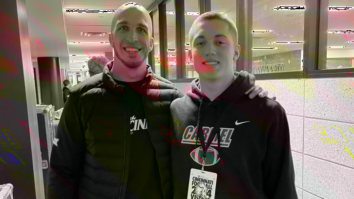
2026 Quarterback Anthony Coellner Recaps Cincinnati Bearcats Visit
Coellner connects with Bearcats Talk.

Coach Prime's Daughter Shelomi Sanders Has Committed To Dawn Thornton And The Alabama A&M Bulldogs
New Bulldogs head coach Dawn Thornton snags another prized transfer.
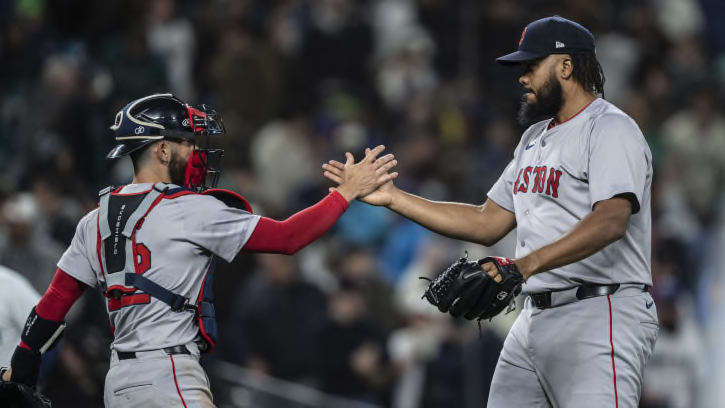
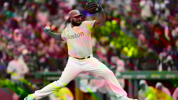
Red Sox Star Could Be Traded To Dodgers In Blockbuster Move After Great Start
It sounds like the Red Sox could make a trade involving one of their top pitchers
New York Mets vs. St. Louis Cardinals How To Watch, Listen, Stream
The New York Mets return home to the west coast to start a home series with the St. Louis Cardinals at Citi Field.
New York Yankees vs. Milwaukee Brewers How To Watch, Listen, Stream
The New York Yankees get back on the road and head into interleague action when they face the Milwaukee Brewers.
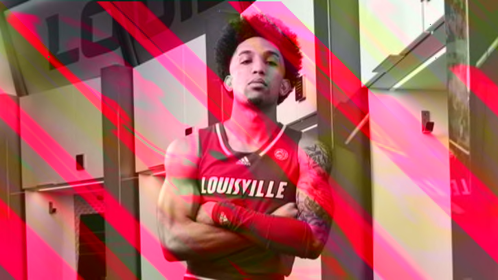
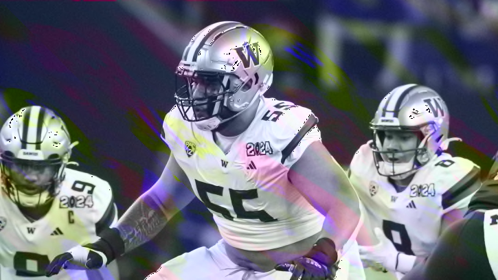
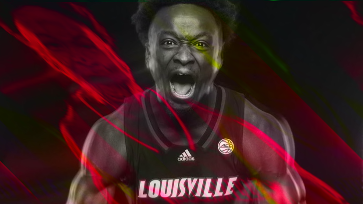
What Chucky Hepburn Brings to Louisville
Here's what the transfer from Wisconsin brings to the table for the Cardinals.
Sixers News: Joel Embiid’s Mysterious Health Concern Revealed
Philadelphia 76ers center Joel Embiid is battling more than just a knee injury.
Lions' Day 2 Mock Draft
What can Lions do in second and third round of NFL Draft?
What Aboubacar Traore Brings to Louisville
Here's what the transfer from Long Beach State brings to the table for the Cardinals.
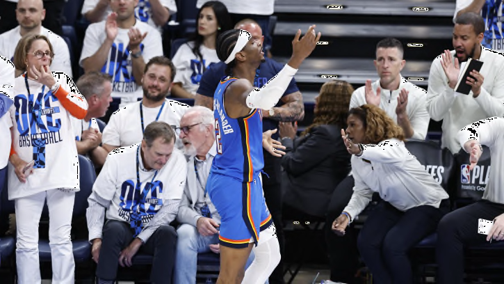
Stiles Points: Last Season's Play-In Tournament Trip Could Prove Large Saturday for OKC Thunder
The Oklahoma City Thunder's play-in tournament win last season could loom large on Saturday.
Potential Chicago Cubs Target Could be Traded by Boston Red Sox
A potential Chicago Cubs trade target could be dealt by the Boston Red Sox around the deadline.
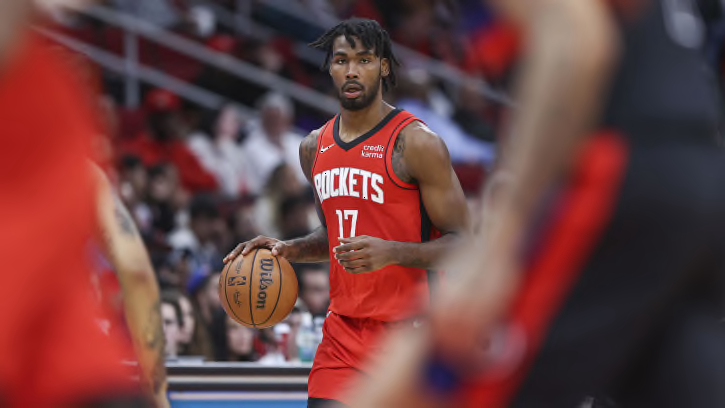
Houston Rockets: A Healthy Tari Eason Takes This Team to New Heights
While there's many different ways the Rockets can improve this offseason, getting a healthy Tari Eason back will make a significant difference next season.
Potential Lottery Pick Tidjane Salaun Officially Enters 2024 NBA Draft.
A french combo forward with a modern skillset, Tidjane Salaun is one of the most interesting prospects in this upcoming draft class.

Baltimore Orioles Leadership Joins Baltimore Ravens During NFL Draft
Baltimore Orioles GM Mike Elias and assistant GM Sig Mejdal returned the favor they extended Ravens GM Eric DeCosta two years ago.
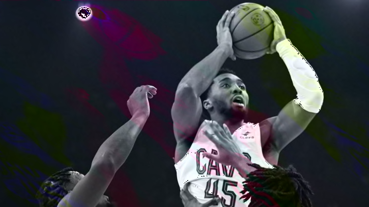
If Nets Can't Land Donovan Mitchell, Who is Next Franchise Star?
While the Brooklyn Nets will likely look to acquire Donovan Mitchell in the near future, who are some other potential options as the next face of the franchise?