
Welcome to FanNation, Part of the Sports Illustrated Media Group
Find and follow your favorite team here. Get the latest news and updates about the team you care most about.
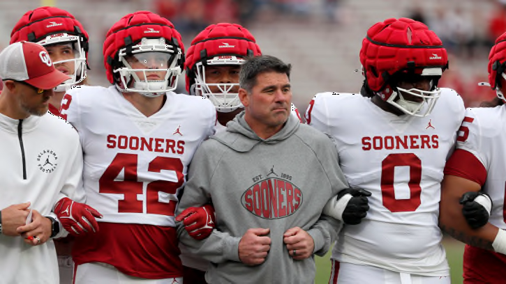
Newcomer Profile: Why Wyatt Gilmore’s Transition to Oklahoma Was ‘Seamless’
Wyatt Gilmore was a big piece to Oklahoma’s defensive line puzzle, and he’s looking to make an early impact.
Recent Articles
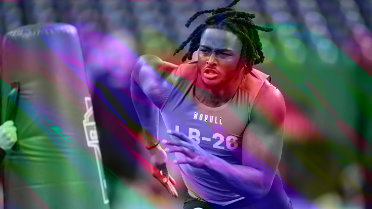
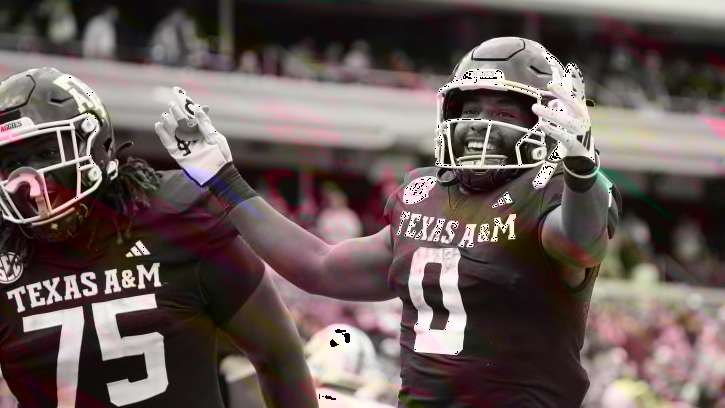
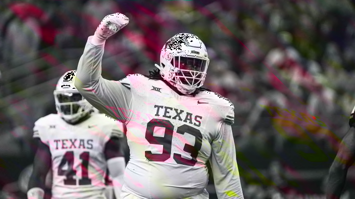
Top 10 Defensive Linemen in the 2024 NFL Draft
The Las Vegas Raiders have Maxx Crosby, Christian Wilkins and loads of potential surrounding them. Do they add to the defensive front?

Former White Sox Top Prospect Could Be Trade Candidate For Yankees
Should the Yankees look into completing this trade with the White Sox?
Chiefs Mock Draft: Champs Trade Back for WR, Add Significant Depth
In the first Arrowhead Report mock draft of the week, the Chiefs land a wideout with their first pick and help set themselves up for a bountiful haul in the process.

Lions Fans Should Chant 'Jared Goff' After Caleb Williams Drafted
Why 97.1 The Ticket radio host wants to hear 'Jared Goff' chants.

Oakland A's Fireballer Breaks Team Record in Win vs. New York Yankees
The Oakland Athletics shut out the New York Yankees on Monday afternoon as Zack Gelof hit a two-run homer in the top of the ninth. Furthermore, A's stud closer Mason Miller continued to dominate, striking out the side and making some team history.
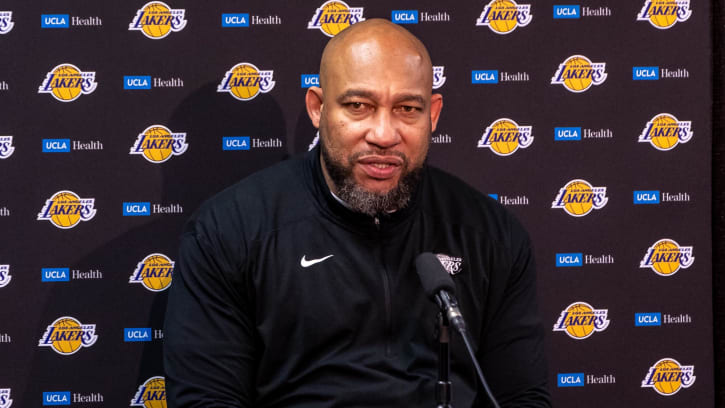
Darvin Ham's Controversial Message After Lakers vs Nuggets Game 2
Darvin Ham opened up a can of worms.
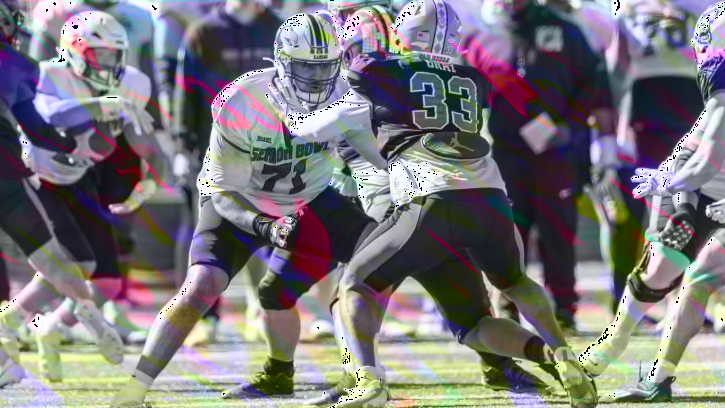
Guard Looks Like A Deep Position If The Saints Look To Fortify Their Offensive Line In The NFL Draft
A closer look at a few of the top prospects in a deep NFL Draft class at guard.
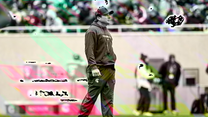
Michigan State Among Favorites for 3-Star LB Di'Mari Malone
The Michigan State Spartans are among 3-star linebacker Di'Mari Malone's top-four teams.

Combat Sports Today: Ryan Garcia Upsets Devin Haney, PFL Delivers Smash Hit Signing, UFC 303 Ticket Prices
MMAKO's Zain Bando recaps a wild week in combat sports.

Pittsburgh Pirates Win on Monday as Rookie Hurler Puts Together Historic Effort
After being swept over the weekend by the Boston Red Sox, the Pittsburgh Pirates got a much-needed win on Monday night, beating the Milwaukee Brewers. In the win, Pirates' rookie Jared Jones continued to make history.
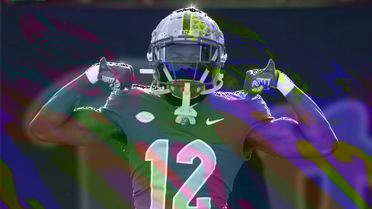
Three Pitt Players Taken in Latest ESPN Mock Draft
The Pitt Panthers had three Pitt Panthers take in the latest ESPN Mock Draft
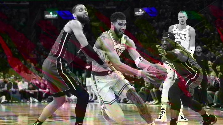
Celtics Discuss the Keys to Managing the Heat's Runs
An 18-2 surge by the Heat in the final frame made for an uncomfortable finish in the Celtics' series-opening win at TD Garden. It's momentum that could carry over into Game 2 for Miami.
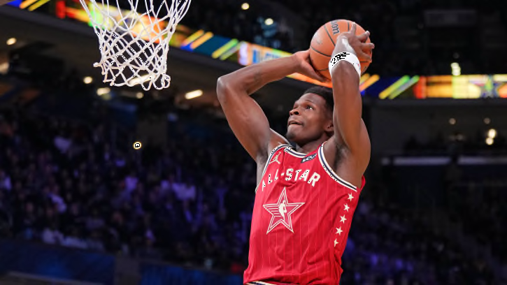
Anthony Edwards' New Adidas Shoes Resemble Michael Jordan's Kicks
The adidas AE 1 is dropping in a red and black colorway that looks a lot like Michael Jordan's sneakers.

Preview, How To Watch: Ole Miss Rebels Baseball Hosts North Alabama Lions
The Ole Miss Rebels are playing host to the North Alabama Lions on Tuesday for a rare daytime midweek game.

New York Mets' Star Closing in on Milestone Accomplishment
The New York Mets lost to the San Francisco Giants on Monday night but Pete Alonso hit his 199th career home run in defeat.

Sports Illustrated Conor Orr's Mock Draft Has Bills Staying at 28, Early Round Trades By Pats and Jets.
Orr predicts the Bills will stay put to draft for need, but notes that they should trade up to select better talent. Pats trade back from pick 3 and the Jets trade into top 5 to find talent for Aaron Rogers.
Wally: Final Colts 2024 7-Round Mock Draft
The Indianapolis Colts make multiple moves to secure several positions in the latest 2024 mock draft.
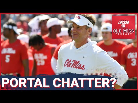
Rebels Should Pursue These 5 Transfer Portal Players | Locked On Ole Miss Podcast
Trent Howland or Peny Boone will allow the Ole Miss Rebels to be more complex offensively, and these are the top five players I think Ole Miss should sign.
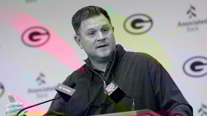
Packers’ Gutekunst Expecting ‘Boring’ Draft
Drama? Not in the Green Bay Packers' draft room. The work is done. Now it's time to make the picks.

Atlanta Braves' Catcher Continues Hot Streak, Joins Exclusive Group in History
By hitting another home run on Monday night, Atlanta Braves' catcher Travis D'Arnaud is now on a historic tear at the plate.
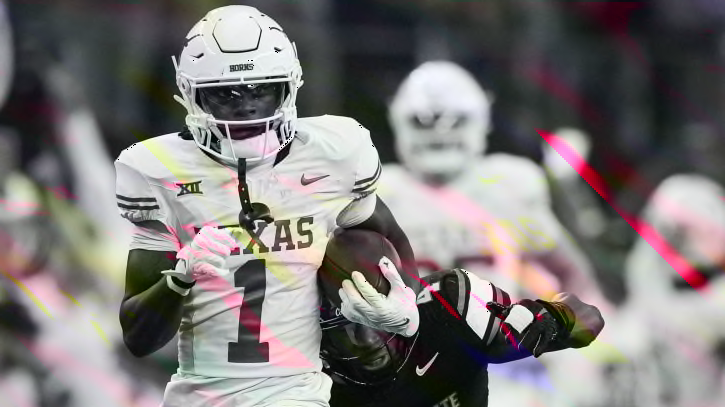
New York Giants Draft Preview: WR Ainias Smith
Could Texas A&M wide receiver Ainias Smith be a Day 3 option for the New York Giants?
Three Fastest Fallers in the 2024 NFL Draft
These three players have seen their stock fall significantly in the 2024 NFL Draft and should be players the Las Vegas Raiders should try to avoid.
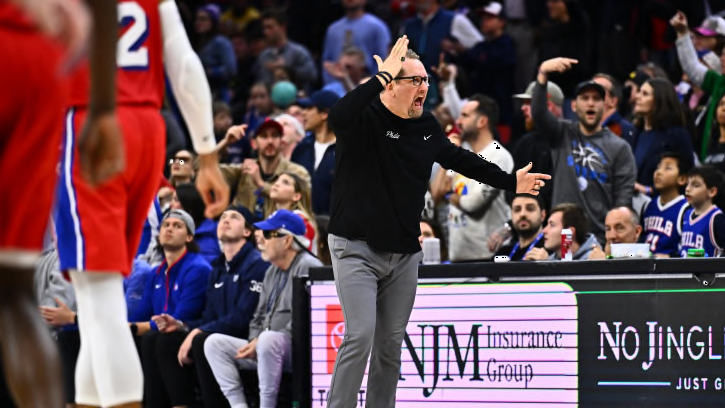
Sixers’ Nick Nurse Sounds Off on Final Sequence in Game 2 vs. Knicks
Nick Nurse reacted to the final critical sequence of the Philadelphia 76ers' Game 2 loss against the New York Knicks.
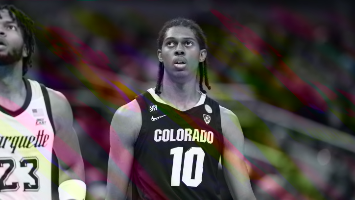
Cody Williams Declares for NBA Draft, Spotted in Oklahoma City's Game 1 Win
The younger brother of the OKC Thunder's star forward Jalen Williams has attended games since his freshman season ended, coinciding with his 2024 NBA Draft commitment.