
Welcome to FanNation, Part of the Sports Illustrated Media Group
Find and follow your favorite team here. Get the latest news and updates about the team you care most about.
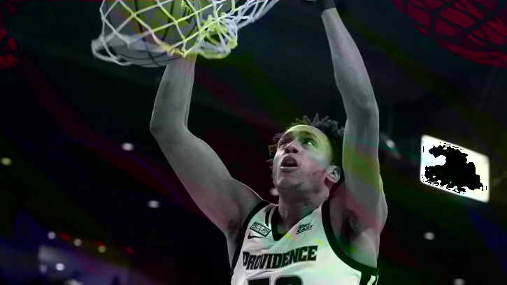
BYU Basketball will Reportedly Face Providence in the Big 12-Big East Battle
Next season, BYU basketball will face Providence in the Big 12-Big East battle according to a report from Jon Rothstein. The Cougars will make the cross-country
Recent Articles
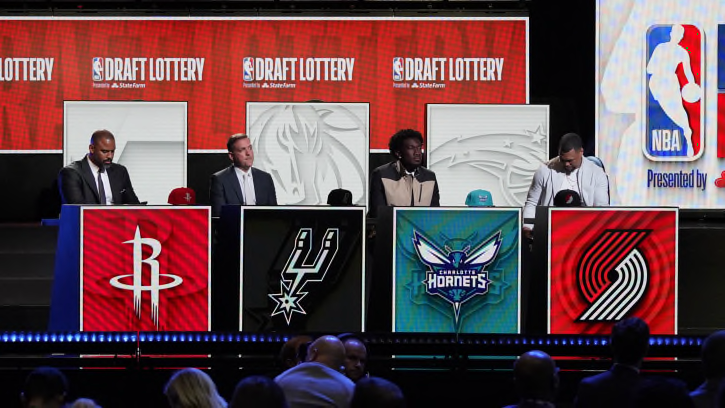
NBA Draft: Zaccharie Risacher Enters Draft as Intriguing Option
French forward Zaccharie Risacher entered his name to the 2024 NBA Draft Monday.
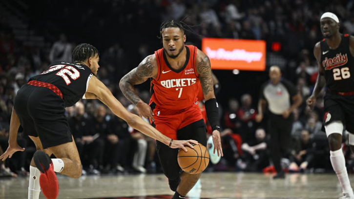
Cam Whitmore’s Development Could be Pivotal to Rockets Reaching Ceiling
Houston rookie Cam Whitmore had a great first season, but will need to further improve for the Rockets to reach their apex.
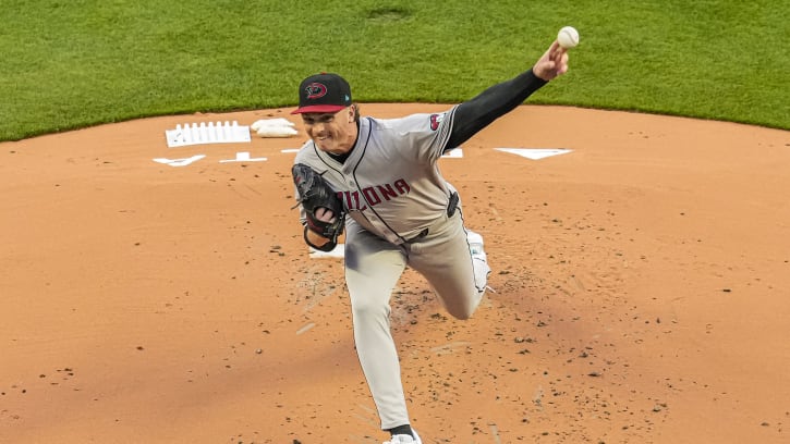
Can Houston Astros Recover From Disastrous Start?
The Houston Astros have already dug themselves into a massive hole, but can they pull out of it?
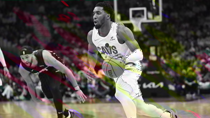
This Has Been A Non-Issue For Donovan Mitchell So Far In Playoffs, Cavs Opinion
Donovan Mitchell appears to have no knee issue as the Cleveland Cavaliers take a 2-0 series lead over the Orlando Magic.
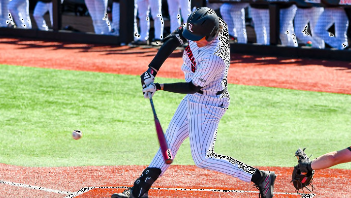
Fast Start Fuels Run-Rule Victory in Louisville's Rematch vs. Western Kentucky
The Cardinals avenge their loss against the Hilltoppers from earlier in the season.
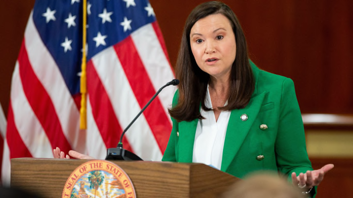
AG Ashley Moody Reveals Florida Could Join FSU Appeal Against North Carolina Judge
Moody has supported the public university in the past as she requested several documents from the ACC including the all-important Grant of Rights agreement.
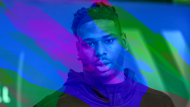
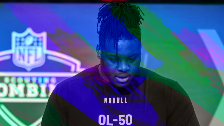
FSU Football NFL Draft Preview: TE Jaheim Bell
Bell is undersized but his skill set and athleticism could be too much for someone to pass up as the draft progresses.
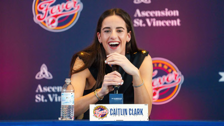
See How Much Money Each Sneaker Brand Offered Caitlin Clark
The Wall Street Journal reported how much money each sneaker brand offered Caitlin Clark.
UNC Basketball Lands First Name From Transfer Portal in Unusual Way
UNC basketball guard Seth Trimble is no longer considering a move to another program.

Is New York Mets Star a Possibility for Cubs at Trade Deadline?
The Chicago Cubs could be an ideal landing spot for a New York Mets power hitter.
Highly-Regarded In-State Defensive Back Announces Commitment To FSU Football
The Seminoles have added another prospect to their #Tribe26 class.
West Virginia will meet Georgetown in the Big East/Big 12 Battle
Former Big East rivals will reunite in the Big East/Big 12 Battle
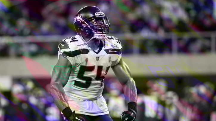
Report: Potential Bengals First Round Target Rising Up Draft Boards
The Bengals have the No. 18 pick on Thursday night.
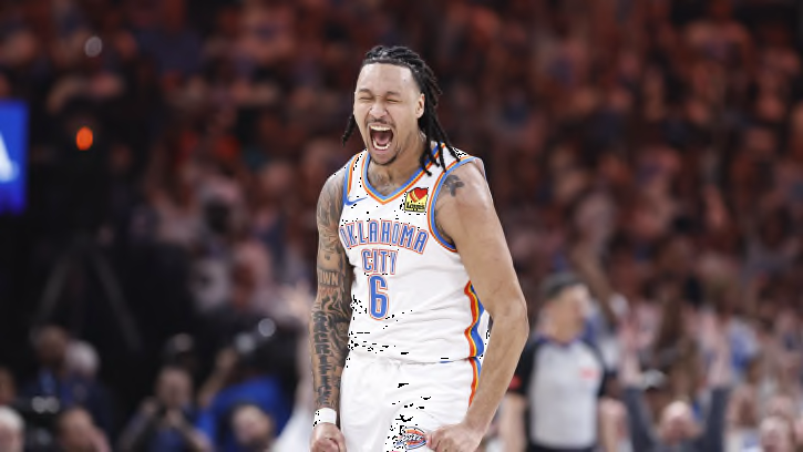
Jaylin Williams Could See an Uptick in Playoff Minutes
Oklahoma City’s backup big might have to step up in a bigger role the rest of the series.

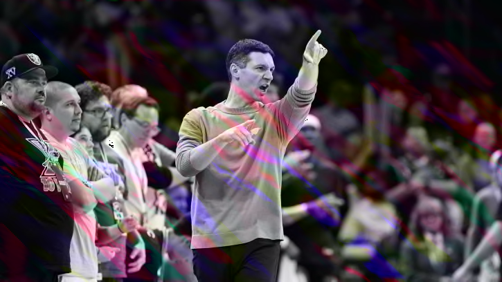
OSU Basketball to Face Seton Hall in Big East-Big 12 Battle
The Cowboys will match up with the reigning NIT champions next season.
NFL Power Rankings: Washington Commanders Near Bottom Entering NFL Draft Weekend
With the NFL Draft coming up the Washington Commanders have a lot of room to grow, but still a little to fall if things don't go well.
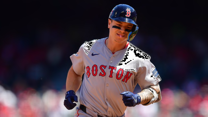
Phillies Predicted to Boost Lineup at Trade Deadline with Red Sox
The Philadelphia Phillies are predicted to add to their lineup at the trade deadline with a Boston Red Sox slugger.
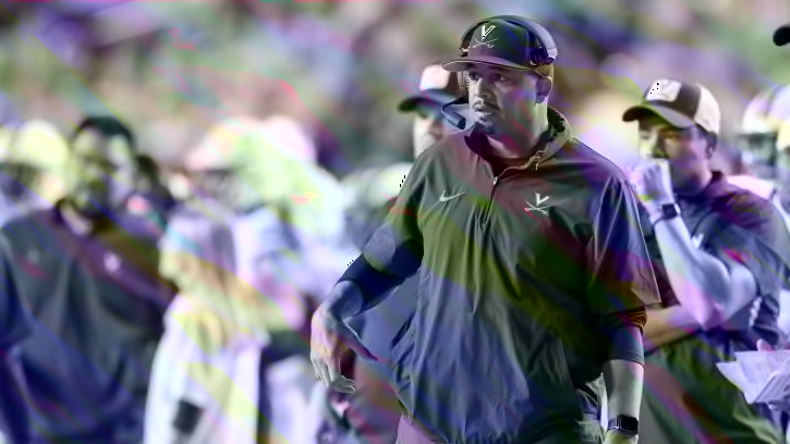
Virginia Football Schedules Home-and-Home Series With Washington State
Virginia and Washington State will meet for the first time on September 27th, 2025 at Scott Stadium and then the Cavaliers will visit the Cougars in Pullman in the 2031 season.
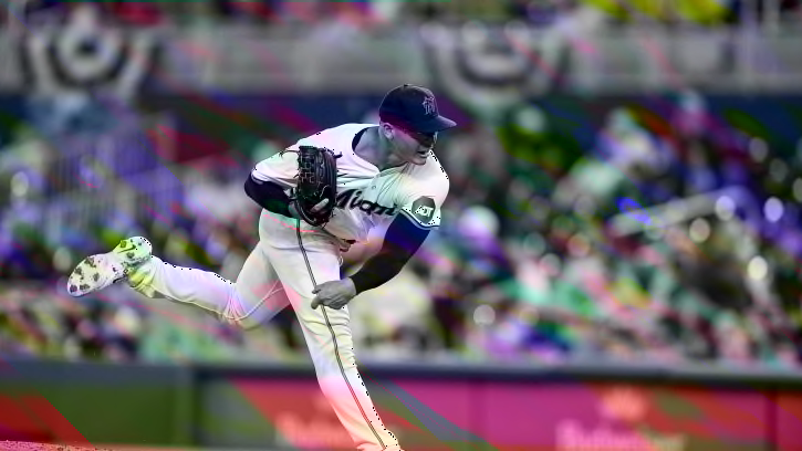
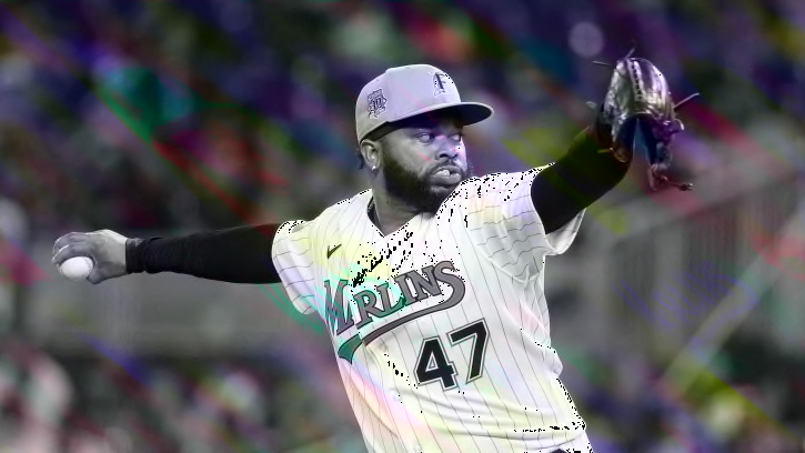
Baltimore Orioles Could Pull Trade for Marlins Aces at Deadline
The Baltimore Orioles are viewed as a team that could pull off a trade with the Miami Marlins for an ace-caliber arm.
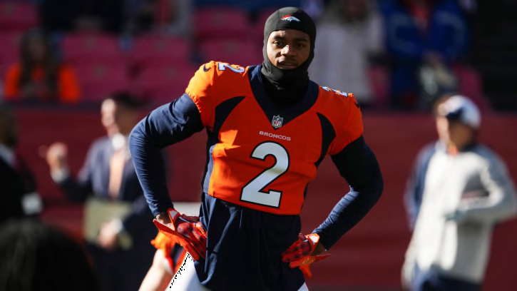
Report: Broncos Make Contractual Decision on Patrick Surtain II
Denver beat the May 2 deadline.
OKC Thunder: NBA Offers Clarification On Sunday's Challenge Confusion
The Oklahoma City Thunder saw clarification from the NBA on the controversial challenge ruling on Sunday.
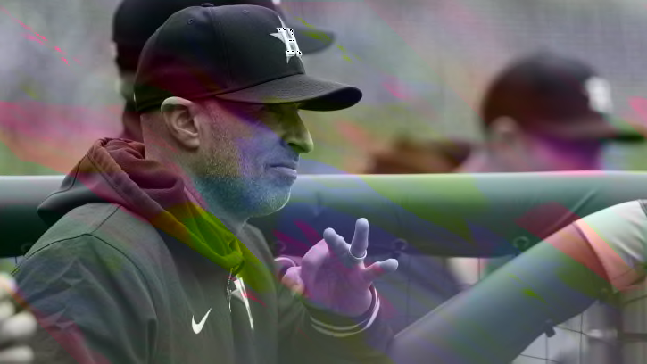
Tommy Henry is Back in a Pinch
With a rotation decimated by injury, the recently demoted left-hander is brought right back up to start against Steven Matz and the Cardinals. Here is a game preview for April 23rd.

Report: Twins' Justin Topa could begin rehab assignment this week
Topa started the season oon the injured list due to left knee tendinitis.
Texas Rangers Ink World Series Champion Pitcher to Contract
As they deal with several injuries in the starting rotation, the Texas Rangers have signed free agent pitcher Johnny Cueto to a contract.